Sunday 26 May 2013

Conclusive Statement


The steam stack project has definitely been a positive one. I am very pleased with the outcomes and think that they will suit my portfolio greatly. Having not done anything specific for my portfolio for a while it has been nice to focus on something that I would like to produce because of the fact I think it will work well in context.
I feel that having produced these pieces of work that they have helped me reach a new level in my practice and a fresh way of building upon my direction of image making.

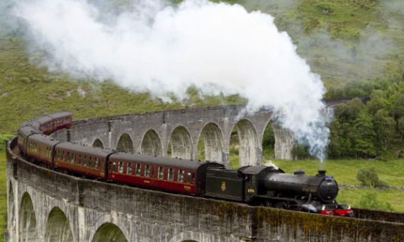
Because this project has included new ways of image making for me it has sparked enthusiasm and excitement and as a result helped produce productivity, especially once knowing how my images would turn out; I think that overlaying the watered ink was completely the best thing I could have done!

However, I think that I could definitely build upon what I have here, and if there were more time I would have pursued a Steam Liner image to complement the Paddle Steamer. I may well have also thought about applying these pieces to event posters as I think that they would be perfect for an indie music event, just like Methane Studios pioneer. I would have also thought about sending them off to Old Glory steam and vintage preservation magazine with the possibility of some artistry work from new clients as an outcome.

With this work and style I now have a grip of, I can think about producing work in this fashion for the local area of where I will be living to sell in farm shops. It would be great to see a series of vintage tractors, or farm animals done in this style, exciting prospects indeed.

Portfolio (Outcomes In Context)


I think that it's important to show these images on context, amongst my other portfolio work. I unfortunately couldn't get any way of showing it within a folder as opposed to a long drawn out line of images. You can always check out the Website and Tumblr for another take on the images in context:


Monday 20 May 2013

Robin Howlett


Robin Howlett has been working as a designer and illustrator since 1984 and won first prize as Young Animator of the Year in a BBC/UN/ASIFA joint sponsored international competition.
She now concentrates on freelance illustration, specialising in art deco and all of her work is executed digitally.

It's interesting to note that she is actively seeking commissions from all around the world, and have as a result has worked for the US, Sweden, France, Belgium, Spain, Singapore, Germany, Italy, Cyprus, Australia, Mexico… and others.
As well as illustration, Robin also specialise in designing letter forms and icons for logos, packaging.

Again, i have had a reply from Robin relating to self-promotional work and her life style. Here is her reply to my email:


Hi Nathan Well done for being proactive; but I'm not sure you're going to want to hear what I've got to say… Illustration has become a very tough career.  It is starting to swing around (for me anyway), but the plethora of cheap (some of it very good) photography and illustration available on line has done a lot to put people like us out of a job.  I'm luckier than most, as illustration is a "part-time" job for me.   I studied at Kingston, actually majoring in animation, but couldn't get work in that field as there was nothing about back then.  So I took a job as a visualizer for an ad agency.  From there I built up all my designer skills until I ended up running agencies.  So, first and foremost I am a designer.  The illustration came along when, aged about 45 I sold my agency and went freelance.  My illustration was varied back then – I'd take anything.  After about a year, it became clear that my folio was developing an art deco trend – so I put up a new website, claiming to be an art deco specialist.  It worked wonders, and the work is now all deco.  I have really busy times (the past few months have been good) but I also have very dry times, where I certainly could not live on the money that comes in from illustration alone.   I am lucky, because I supplement my designer income with my illustration.  And that's the trick really – you must find yourself a source of regular income, that gives you the flexibility to do the commissions when they do come in.  With luck, it will grow and one day you might even be able to give up the day job completely.   But you have chosen a tough profession my friend.  If I had one piece of advice it would be SPECIALISE.  Set your site up so that your specialism is really clear to the art directors AND the spiders, (KEYWORDS ARE SO IMPORTANT) then your phone will ring.  Don't just be "an illustrator", because you will be just another one of thousands.   Be flexible, never drop a deadline, be prepared to take some right shit from the clients (they are all better illustrators than you, don't forget) know when to stick up for your vision and when to meekly say "yes, you're right, why didn't I see that?"   My very best wishes to you and I hope that your voyage starts off with a fair wind behind you!   Kindest regards, 
Robin Howlett 

Paul Catherall


Paul Catherall is a London-based print maker and illustrator know for his clean, sharp linocuts of achictectual landmarks and illustrations for high-profile clients. He draws inspiration from classic mid 20th century poster designers such as Tom Eckersley and Edward Wadsworth and has an expert eye for composition and colour with consummate draughtsmanship to create striking and iconic images.

I am looking at Pauls work because of his clean, sharp posters. These interest me and offer potential in my own work. I could easily make these steam stack illustrations in to clean, crisp poster works.


Patrick Morgan


Patrick lives and works in London having graduated from Kingston university in 1999. His freehand style approach to work has been turning the heads of all the big names and his recent commissions include London Olympics 2012, English National Ballet and Tom Ford bespoke womenswear. Past commissions include London Underground Advertising, Royal Academy of Arts, Waitrose Headquarters, Coca Cola Headquarters, The Body Shop, The Daily Telegraph,The Observer, The Independent, Timeout Paris/London/NewYork, The New York Times, Saatchi & Saatchi, and MC Saatchi.

Again, i have chosen to look at Patrick's work because of his line work and once more it is very similar to my water technique over ink.


I have emailed Patrick with my self-promotional email to find out about how he works, etc. I thought i'd include his reply here:

Hi Nathan,
Sorry I'm planning 2 shows in London so really busy at the moment.
Illustration is super tough and with people with so many similar styles you need an agent to represent you to help you get them first jobs.
I looked the site. Well done, but dont think of just one style these days people dont mind various techniques it keep it fun for you too.
Good luck
Patrick
 
ps exhibition dates on my site soon or twitter so come along...good luck.


Alan McGowan


Alan is an artist that uses traditional materials; ink, water colour, etc, but produces work in a contemporary way. Having supplied artwork for packaging, editorials and publishing t name a few, he certainly knows where the work is.
I have selected Alan to draw inspiration from because of his loose style that flows through his art work, it reminds me of when i produce the water over the ink part of my working process.

http://illustrationart.net/index.html


I have also had a reply from Alan to my self-promotional studies questions. Here are his Answers:


Hi Nathan Getting started is never easy and probably less so than when I did back in the 1980's. Still you have to try. Advice - make sure people know about your work; publicise yourself; go and see people in magazines, newspapers , publishers etc; have something tangible to leave with them (postcard or printout etc). Keep doing what you believe in and hopefully you will find other people that believe in you too. Keep your overheads low (I worked from a bedroom for years). I've nearly always done a bit of teaching, so to that extent I have had part-time jobs, and that does help the cash situation - just avoid the "other" job taking up so much time that it totally dominates. Just try and get out and get some experience, the challenge is there to be met! Good luck Alan

Sunday 19 May 2013

Sarah Kelly


Sarah Kelly is an illustrator that produces work in partially the same style as myself within this project. The only down side to Sarah is that there isnt much information about her online... However, her client list includes John Lewis; Haymarket Publishing; Oxford University press; piccadilly press and Pearson Education.

Its clear from that list that she works editorially, and with her style of work that makes sense. Thinking about my own work, i dont think that the time scale given for editorial work would allow me to produce work to a great standard. But again, it's nice to see a similar style that is working well.

http://www.the-annexe.com/sarah_kelly/page.html


Gary Redford


Gary Redford is an illustrator that has a vintage style but with a contemporary twist. His digital illustrations are used for advertising, packaging, editorial and book publishing internationally for some of the worlds’ top brands, and his client list includes; Bupa; Debenhams; Google; Heathrow Airport; Kelloggs; Land Rover; Lotus F1 Team; Marks & Spencer; McVities; Orangina; Shell; Telegraph; Virgin; Waitrose; and Wall Street Journal.


I have chosen to feature Gary Refords work within this project because i feel that i can draw inspiration from what he does and his style he uses. Like this steam stack portfolio pieces project his work is digital and clean, the only difference is that i overlay a rough watered layer. Here is an example of Gary's work:


I have taken time to email Gary with my self promotional questions, but i thought it'd be obvious to include his reply here too:


Hi Nathan Thanks for your email, yes its a good idea to have another steady means of income when you first start out, it will also help with funding some self promotion  i had a look at your tumblr, its nice work, i would recommend sending samples of your work to newspapers and magazines and also to take a page in contact illustration and have a look at the discussion boards on AOI theres lots of advice and help on there Good Luck !  Gary

Saturday 11 May 2013

Steam Train


The fourth and final installment of the steam themed vehicles is the train. Again, a strong part of the English heritage that i would like to continue to reflect. The aim would be to keep to roughly the same style/template of image and instead of a couple of fair tents or living van in the background, i would like the piece to include snaking carriages against a hill-side background inspired by Arik Roper's illustration (http://www.arikroper.com/) found on the cover of the most recent Black Crowes album Before The Frost:


With this in mind of roughly what i am aiming for i have begun scowering both books and internet for images of trains that reflect my ideas The first few old black and white images are form a book titled In and Around Blandford, which is my hometown:


The outcomes:


Having scanned my final outcome i am displeased with it because of the line quality i obtained whilst putting the pen over the pencil lines. However, the only thing that this means is that i will have to work extra hard in Illustrator to correct myself.


Scanned and detailed in Adobe Illustrator just like the previous three pieces of work, this is at last now ready to be coloured digitally.

Using The same colour schemes once again as these seem to be working the best, either black or red has to be my initial reaction if i were to pick between colours. There's something about the burgundy that makes me think of steam trains. The green however does work well and is reflecting of British Racing Green, But i think that green would be best suited on the steam roller.


Ready for the water over lay, here is the scanned outcome ready for use again having been live traced at 125:

These outcomes have greatly restored my faith in these pieces of work. Each one is tied together fully now in my opinion as before they felt lose and un-concentrated. I still think that it's between the red and black outcomes that i will have to be choosing from though...